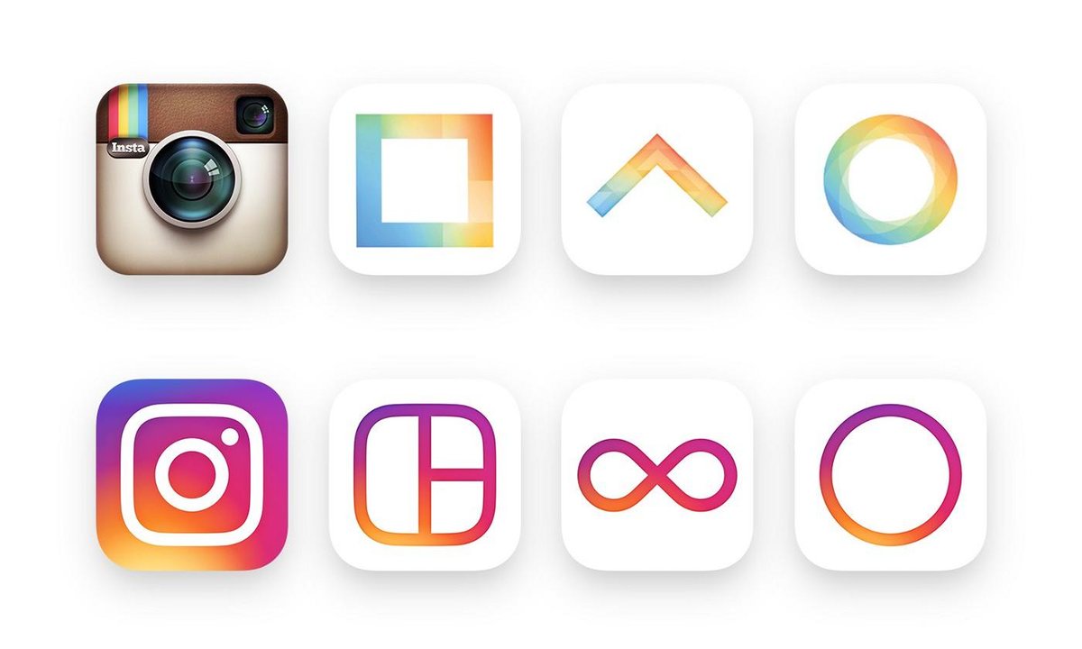
If you’re like me and update your applications all the time, you might have noticed that Instagram has a new look. Even if you’re not like me, you probably would have heard about the new look as it has attracted a lot of online noise, although this shouldn’t come as a surprise.

A lot of people are talking about the logo, but take a step back and what this is really about is a much wider shift in branding. Instagram began to establish a look that ties their different products together including; Boomerang, Layout, and Hyperlapse. The change to these three isn’t quite as dramatic, and in some ways, the retro polaroid logo has just caught up with the rest. Instagram’s fundamental shift has been to create a Flat design. Which is basically what it sounds like.
Flat design is a minimalistic design approach that emphasizes usability. It features clean, open space, crisp edges, bright colours and two-dimensional/flat illustrations.
A similar change recently happened with Google. The look that carried wisdom and a sense of classical elegance was now being taken for some kind of child’s refrigerator magnet, according to an article in The New Yorker. However, this also came at the same time as their microphone icon and single multi-coloured ‘G’, adding to their brand as a whole.
As well as the new icons, Instagram has stripped back the user interface inside the app taking all colour out and leaving everything in black and white apart from users photos. I feel like this is a nice compliment to their claim of reimagining the logo to reflect the community over the last 5 years. They don’t feel a need to throw color in the UI of the app because this naturally comes from the community. Head of Design at Instagram, Ian Spalter said in a longer post on Medium.
While the icon is a colorful doorway into the Instagram app, once inside the app, we believe the color should come directly from the community’s photos and videos.
So there has been a lot of reviews and most people seem to be hating on the logo. In fact, I myself am guilty of not being a huge fan. I guess the media are more likely to talk about the haters?
But when we actually start listening to a lot of the design world (the people that are experts in this field): including former Instagram designer Cole Rise, it’s not all doom and gloom. There are a lot of people that see this as the right direction and the more I research it the more I’m also convinced. In fact, I tend to find these things grow on me.
What is being agreed on more favourably across the board is the in-app UI. Some people still think the new icon is not great but are really happy with what has changed under the hood. A big plus is being able to edit against a white background so your eyes don’t play tricks on you. While all the functionality is the same, the biggest change to adjust to is in the editing section before you post an image or video. Instagram are also getting ready to launch their business profiles which are in beta at the moment, bringing further change for particular uses.
![]()
At the end of the day with 400 million active users posting 80 million photos and videos a day, I think it’s safe to say this change of design isn’t going to stop people using the app. And with such a large and diverse group of users, you would be silly not to keep using it!
Take advantage of a 14-day free trial of SalesSeek. Start your free trial with SalesSeek today.


