I believe that when it comes to our product, the visuals matter. This does not only apply to the look and feel of the application but also how data is presented.
A user experience that is not intuitive is cognitively draining, as seen in the popular blog post, Your App Makes Me Fat. Similarly, data that is not illustrated or has poor visual representation, is likely to be ignored, difficult to understand, or worse still misinterpreted.
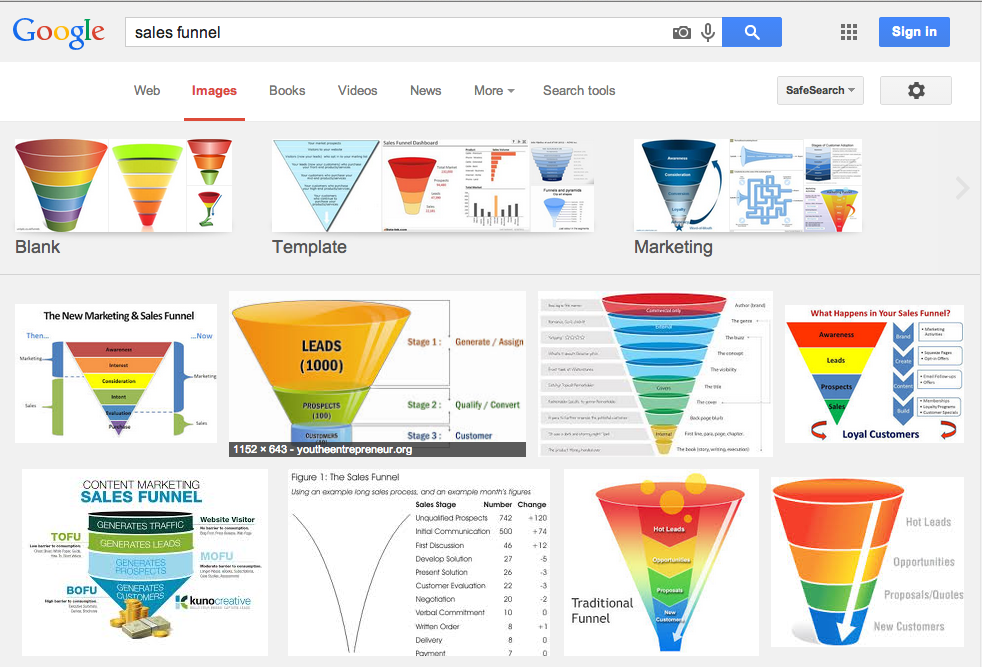
Google image search shows that a ‘sales funnel’ is nothing new.

A Traditional Funnel Visual
It also provides a bunch of examples which could do with some serious TLC. These traditional funnels are OK for somebody wanting a broad, aggregated view with little attention to detail or aesthetics! How many busy salespeople do you know are likely to pay much attention to these? If they did, what insights would they gain?
That’s why we’ve re-imagined the sales funnel to a tool which will help the full hierarchy from salesperson through to CEO and everybody in between – improve results and gain insights.
Why? We believe that the funnel should make sales and marketing data:
- Enjoyable
- Understandable
- Easily Analysed
- Interactive
- Animated
Simple, useful and multi-dimensional

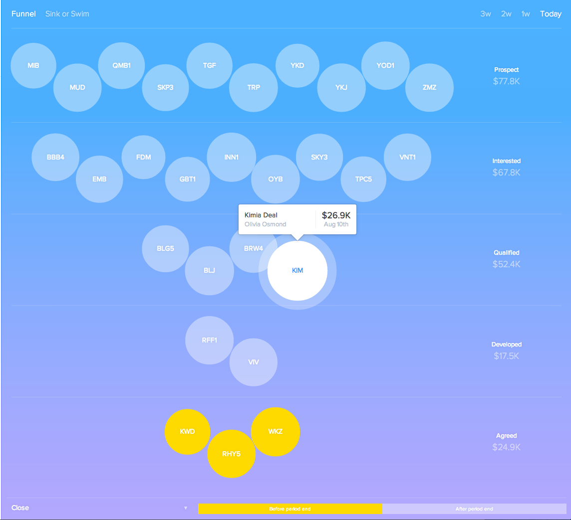
SalesSeek Sales funnel
- Circles represent deals. Bigger the circle, bigger the deal.
- Drag and drop deals between phases.
- Flick through the funnels progress over the last month.
- Filter colours based on Activity, Close Date, or Forecast.
What else do we visualise?

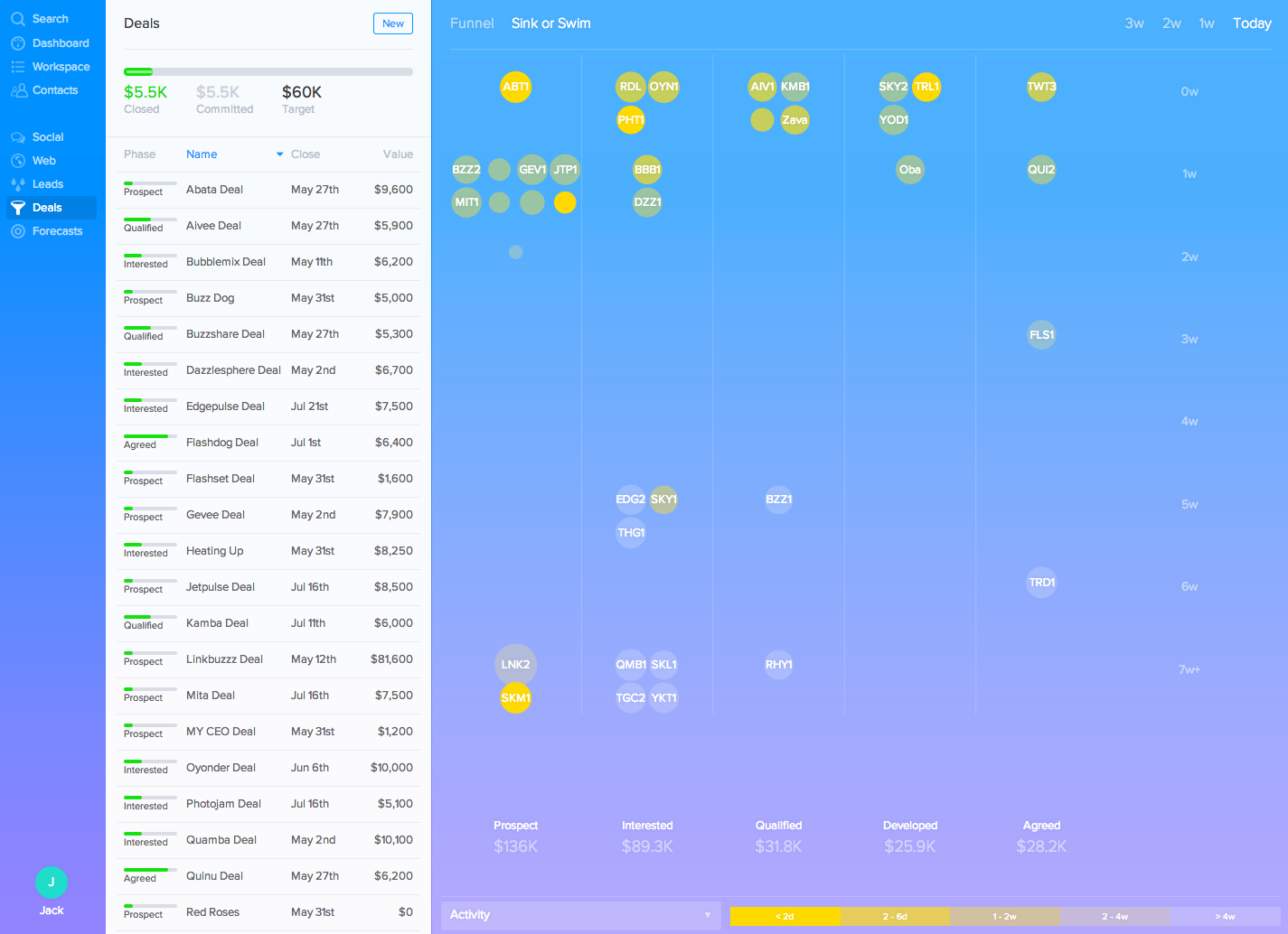
SalesSeek Sink-or-swim
Combine all the filters above from our funnel graph, but rotate it 90° and change the y-axis to represent time in current deal phase. Now you’ve got another whole dimension and can see which deals are moving with high velocity and which deals are sinking.
Why do we emphasise this?
The power of visualisation, when done right, allows time-poor individuals to quickly analyse data and draw the information they need from it. I believe a salesperson’s day-to-day struggles have been overlooked with existing funnels, and consequently they also fail to properly assist managers to find ways to help their team.
SalesSeek in action: Examples:
At a glance with the activity colour filter applied to their funnel a salesperson can see which deals they’ve contacted recently, and which deals they’re letting get cold. They can also see what phase in the sales cycle these deals are in. Within seconds they can see who they need to call, and prioritise who they need to call first. Now change the filter so that you can see those deals closing in the current period. Are you on top of all these or do some need to be reconsidered?
Perhaps you get in first thing Monday morning and your boss is going to wonder why you haven’t progressed any of your prospects in the CRM. You’ve done the work and some may have even progressed multiple phases but do you really have time to go into each individual record? Simple drag and drop them to reflect how they’ve progressed while staying in the funnel view.

Its not my first time to visit this website, i am visiting this web site
dailly and take good facts from here daily. Maglia Juventus
This excellent website definitely has all
of the information I needed concerning this subject
and didn’t know who to ask. trøjer Spanien